HW #12-Archive a Website
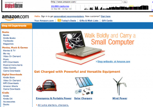
I looked up Amazon.com on archive.org.
Currently, Amazon’s layout is extremely easy to understand and navigate. There is a large white search bar at the top center, a shopping cart at the top right, and advertisements all along the side of the page.
In November of 2003, the site’s layout looked rather different. The search bar is to the far left, and does not come across as a search bar as easily as it currently does. There are tabs at the top and center that give the different categories such as ‘apparel and accesories’ or ‘electronics’. Rather than the advertistments being on the side of the page, the advertisment was right in the middle of the Amazon page in 2003.
In October of 2009, the site differed as well. There are the many different categories on the left hand side, separating the subcategories by use of a different color. The shopping cart and account information is present on the top right, and the search bar is at the very top of the page.
Archive.org could end up being an extremely helpful tool in departments such as graphic deisgn. To have the ability to do this is highly interesting and entertaining!


Don't be shy, leave a comment…